Copper
Amy Shawley

One of the things I love about Golden's Iridescent colors is that they offer two shades of Copper: Iridescent Copper and Iridescent Copper Light. This is fantastic because when you look at raw copper (pictured below) it will change from a reddish to a more golden hue depending on the way the metal catches the light, so it's nice to have ready-made colors reflecting this effect! Today's post focuses on these two hues of copper and a couple of my favorite ways to use them!

Below are some simple steps for how to use these coppers with texture and enhance them with a look of patina.
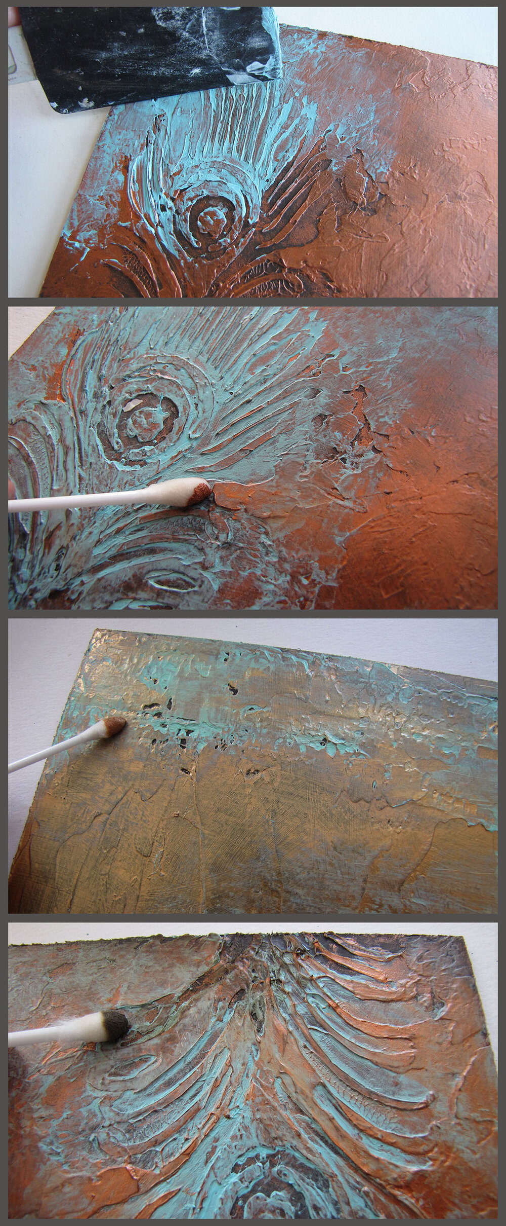
First you will want to start by texturing a substrate and since I used two coppers here, I textured two substrates (6x6 inch panels). To create a texture, I used Heavy Gel (Semi Gloss) and moved it around with a palette knife. On one surface I created a freeform texture with some areas that were a little more rough and some that were smoother. On the other substrate, I used a stencil to introduce a peacock motif. I obliterated parts the stencil and worked the gel all the way to the edges of the panel. You will want to let the gel dry completely before adding color, I left mine to sit overnight...

Next I added color! I like the look of Iridescent colors over dark underpaintings, so I started with a single layer of Raw Umber on both of my textures, working the color from all angles with the brush to be sure it rested in all of the texture valleys. Let this layer dry before adding the copper. To apply the coppers, I used a rag to buff the color over the brown, using light pressure to ensure that most of the coppers stayed on the texture peaks so some of the brown underpainting would show through. I like to put a little bit of water in my rag to improve the flow of my color with this step. I "buffed" Copper and Copper Light onto my respective substrates, though only the peacock texture and Copper are shown for this step below.


If you like the look of shiny new copper, you can stop here! If you like the look of weathered copper with a bit of patina, continue with the steps below...
I typically just use Fluid acrylics and do thin patches of "patina", but here I wanted to do something different, so I mixed up a thick recipe using Heavy Gel (Semi Gloss) combined with Teal and Titanium White (~50:50).

Use a rubber spatula to "squeegee" the patina recipe into the texture valleys. If there is too much color here, buff some off with a damp rag. If any of your copper areas get too saturated with the patina blue, use a cotton swab or brush to bring back some of the copper shimmer. To add some more depth/weather to the surface, buff some Raw Umber into a few texture valleys and around some of the panel's edges...
Again, depending on your preferred style of work, your art can simply be the texture, or you can expand on it more by adding imagery and layers...


One of my favorite artists, Nick Kundson, paints representational work on actual copper using heat and acids to create natural patinas! I love how he uses patinas to create negative space and build surreal compositions! Check out his stunning work HERE!
Coming up next week: the Golds of Golden and layered textures!